
As is now AMR annual tradition, we kick off the end-of-year celebrations with a gallery of the year's artwork, which like the music it is accompanying, continues to evolve... or in some cases devolve.
As the industry edges closer and closer to digital distribtuion, the record sleeve is becoming more and more a package, one by which too many use to quickly judge its contents. Unfortunately this has meant an increase in the correlation between indistinct or rushed covers, but what's the point of working so hard on all that great music if you're not going to present in a way that validates it. Good album art should be something you want to look at beyond the confines of your iPod, but in some cases, maybe its best that it remains to reside there...
THE GOOD

Cults - Cults
A deceptively simple photograph that captures the pair of Madeline Follin and Brian Oblivion in a state of 'rocking out.' Its classic feel ensured by the grainy black and white, and in capturing a pure energetic state so many music lovers are familiar with, its conveyed kineticism captured in a perfectly frozen moment.

Washed Out - Within and Without
Containing the class and sleek efficiency of a perfume ad, the look of Washed Out's debut cover still manages to capture a moment of intimacy that dovetails with a clean eye for visual design. the three stanza staggering of the band name in particular. It's overbearing clash of ruffled white sheets against perfecty fleshy pink seems to match an equilibrium in a balance of overall cleanliness. It's clinical and romantic all at once.

Mastodon - The Hunter
Despite changing from the regular work of Paul Romano and his kick-ass work for their covers, Mastodon have lost nothing in converting to some new blood. Don't let the precision fool you, this is in fact a sculpture, the product of one AJ Fosick (and here he is crafting it). The psychedelic totem acts as a great visual metaphor for the metal titan's sound: deft construction towards a fearsome totality and surreally engaging in its sheer presence. It only helps that its emphasised by the bold scarlet border and the band's new Viking-friendly logo.
 The Weeknd - House of Balloons
Who said free music had to have cheap design? When the blogosphere-sensation Abel Tesfaye needed a singular image for his free internet mixtape-come-debut, he made some smart choices. Evoking the classic vinyl jazz sleeves of the '40s and '50s, but mixed with a thoroughly modern design sensibility. It's got the artist, the album and even the tracklist all there, and a smartly framed image that's arty, slightly erotic and intriguing. A great formula used again for it's colourful follow-up Thursday.

Who said free music had to have cheap design? When the blogosphere-sensation Abel Tesfaye needed a singular image for his free internet mixtape-come-debut, he made some smart choices. Evoking the classic vinyl jazz sleeves of the '40s and '50s, but mixed with a thoroughly modern design sensibility. It's got the artist, the album and even the tracklist all there, and a smartly framed image that's arty, slightly erotic and intriguing. A great formula used again for it's colourful follow-up Thursday.

Bon Iver - Bon Iver, Bon Iver
The eye easily dismisses this watercolour landscape at first, probably because it could also ironically have been the cover of For Emma, Forever Ago (considering the whole log cabin mythos); but upon hearing the album it becomes clear why its such an appropriate vista. The tracklisting and themes have a lot to do with the abstractions of memory, and how they tie to geography. With lush details curtailed by pooled spaces, or even a blank canvas at its edges. A bit like the way we remember things eh? Woah, deep man etc. etc.
(EDIT: turns out it's actually a watercolour, augmented by physical elements, which is what gives it that mysterious quality. It's hard to explain so just watch this...)
(EDIT: turns out it's actually a watercolour, augmented by physical elements, which is what gives it that mysterious quality. It's hard to explain so just watch this...)

...And You Will Know Us By The Trail of Dead - Tao of the Dead
Band member Conrad Keely has supplied the sleeves of his group's records with impossibly detailed art - usually created with ballpoint pen - and this may well be his nerdiest, most progtastic and wonderfully eccentric yet. In actual fact, it depicts the cast of Keely's accompanying graphic novel; which probably only serve to add fule to the detractors' fire. You can't fault the man's imagination, obsessive sci-fi comic fascination and all...

Rainbow Arabia - Boys and Diamonds
Though the musical contents of the husband-and-wife duo isn't as celebratory or eclectic, it's presented in a lovely little piece of papercraft. The minimal font and heihrarchy given to the artist and album titles mean that the image gains full dominance, a fitting centrepiece and a lovingly pieced moment of celebration.

Com Truise - Galactic Melt
Another image that acts as a clever metaphor for its artist's soundworld. It must have been tempting to go with an image that plays up that spoonerism-tastic name, but instead we get a loving - though not overly garish - nod to eighties graphic design. A muted orange of organised lines literally melts over some geometric shapes, in much the same way the electronic shapes and textures swell and morph across their palette of samples and loops. Props for the Battlestar Galactica-inspired font too.

Dads - Man of Leisure
The side-project for Big Scary's Tom Iansek takes the risk of the visual pun and comes out a winner. The placement of elements is clean and simple, with a bold effective logo at top which juxaposes wit the stylish centre lettering; which in turn highlights the humour of that central image. This man does not care, and it's cool. In an alternate world, where The Big Lebowski's The Dude is a real person, he's tearing his hair out because the image for his solo album has already been done to perfection.

Earth - Angels of Darkness, Demons of Light I
This is just a terrific illustration. Vibrant colours and great character design meet, while managing to tell a story. It could be the cover of a gothic children's book, as it stands, it's a compelling sight to behold while listening to the dusty, epic yawn of Earth's imaginary soundtrack.

Young Galaxy - Shapeshifting
Sometimes, you just can't beat a striking image, devoid of labelling or image manipulation. Despite our brain telling us how the look was achieved - a girl underwater - it is still open to a number of interpretations. Is she falling? crashing, even? resting? At peace or unease? How did she get there? Where is she? An image that engages thought even as it logically gives you all the answers you need.

Unknown Mortal Orchestra - Unknown Mortal Orchestra
What seems a decidedly alien construct is in actual fact a real building, one of many bizarre war memorials turned historical husks now littering Yugoslavia known as 'Spomenik' (have a read here, it's fascinating stuff). That might tarnish the magic a little, but it's no less a brilliant choice for album art, it's a surprise it hasn't been done until now.
THE BAD

Boy & Bear - Moonfire
Why cater to the cool nature of that title when you can settle for a stock nature phot that screams 'I use my instamatic iPhone app to disguise my photography skills.' Bland, bland, bland.

The Answer - Revival
When photographers double-book their shampoo commercial commitments with their rubbishy American rock cover direction... they improvise.

Mediaeval Baebes - Illumination
Mediaeval Baebes (sic) don't need your chivalry! They have their own brand of ridiculously photo-shopped, over-costumed, tart-like sense of male fantasy to cosy them up at night! So what if they lost all sense of feminitiy and integrity on the way to the Playboy mansion's renaissance fair!

Johnny Hallyday - Jamais Seul
No, I don't know who Johnny Hallyday is, but I can only assume he's a coked-up grandpa reverse-engineered from the lovechild of Johnny Depp and Robert Downy Jr., conceived during their own 'lost weekend.' You go J.H.

Jane's Addiction - The Great Escape Artist
"Hey, have you heard the new Jane's Addiction record?"
"They have a new album out!? I didn't even know"
"Sure they do, it's the one with the plasticine freak studying in his room on the front"
"...that's a shame, I guess I won't be listening to the new Jane's Addiction record then"

Lady Gaga - Born This Way
You know what? If this was really Gaga's freakish existence, I'd do her and everyone a favour and drive her at like 500km an hour down the dustiest desert highway I could find, then skid her into a gas station, leap to safety from her scrawny metal frame as she literally screeched into oblivion; then pull out my shades upon the bask of the imminent fireball explosion - turn to the camera and dryly quip, "well... she was born that way."
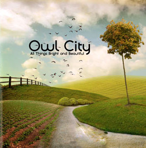
Owl City - All Things Bright And Beautiful
It's as if Adam Young, Mr. Owl City himself, was petrified that greater white America wouldn't get the memo that he was a clean-cut Christian act. So he telegraphed the message loud and clear by naming his new album after a hymn and emblazoning it with a picture of a meadow... because that's what Jesus would have wanted.

William Shatner - Seeking Major Tom
Thank you so much Mr. Shatner and your crack team of 'designer' (that's one) for your silly, silly new album sleeve. Surely even Bowie himself is surely chuckling too hard to notice that that you've cribbed his song's character.

Chris Brown - F.A.M.E.
Never mind the busy, offensively bothced spraypaint and graffiti montage; what exactly are you abbreviating there Chris? You know it should mean something? You can't just put full-stops between the letters of fame because it looks cool, right? I'll resist the temptation of pointing out that it could spell Fists And My Ex and we'll move on...

The Limousines - Get Sharp
It doesn't matter how much effortless chic you put into the design of this cover, or how beautiful the model is modelling the spit bubble. You know why? Cause it's still a disgusting close-up of a spit bubble!

LMFAO - Sorry For Party Rocking
...apology not accepted.
NSFW IMAGES AHEAD

Steel Panther - Balls of Steel
Ok, we see what you did there. Though I'll give you points for inventiveness with the faded price tag sticker that's rubbing off, everything else is just beating the 80s hair metal irony point home with a Thor-sized hammer. At least even the blindest of your followers could spot one of your works a mile off.

No Emotion - Shit Is Bad... But Diarrhea Is Worse
A terrifying glimpse into a future where all obvious medical advice is communicated through poorly executed, puerile albums like this one.

Arrington de Dionyso - Slow Dancin' Under The Moonlight
No, just no. There was obviously a serious communication breakdown somewhere here, how else do we end up with this monstrosity? A self-harming angel mopes and masturbates while watching public sex, as committed through the random scribblings of a sadistic four-year-old.
No comments:
Post a Comment